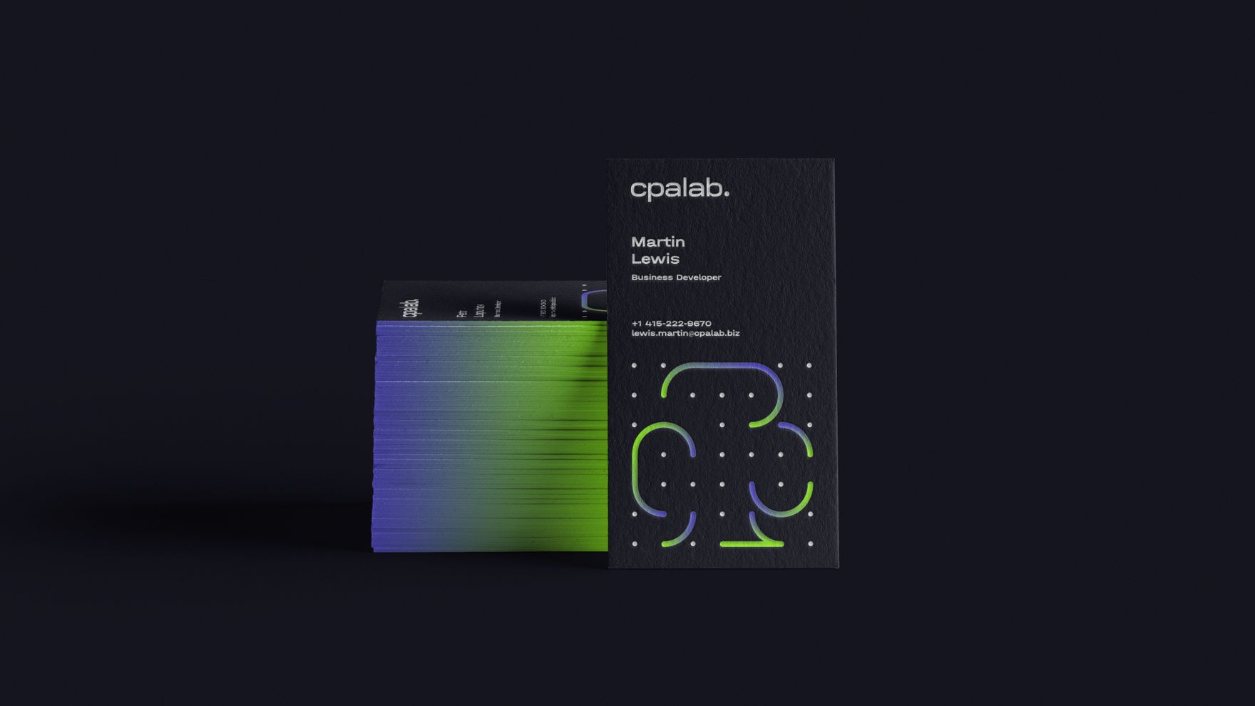
Branding for the partnership marketing platform RevenueLab
RevenueLab is a marketing partnership platform. The company acts as an intermediary for iGaming brands and webmasters who bring the brands traffic.
We were to develop a visual image for the platform geared towards a Western audience and to create a related identity for the company’s second focus, the CPA Lab brand. We had to note the brands’ shared background while emphasizing their individuality.
RevenueLab is the company’s main platform and operates according to a financial model known as revenue share. The company has already made a name for itself on the market.
CPA Lab is the company’s new platform, with a CPA (cost per action) financial model. As this is a new brand, we needed to ensure that it inherited the reputation of the older brand, RevenueLab.
Developing two related identities, underlining their similarities while also highlighting their differences, was quite the challenge. First, we defined the brands’ characters.
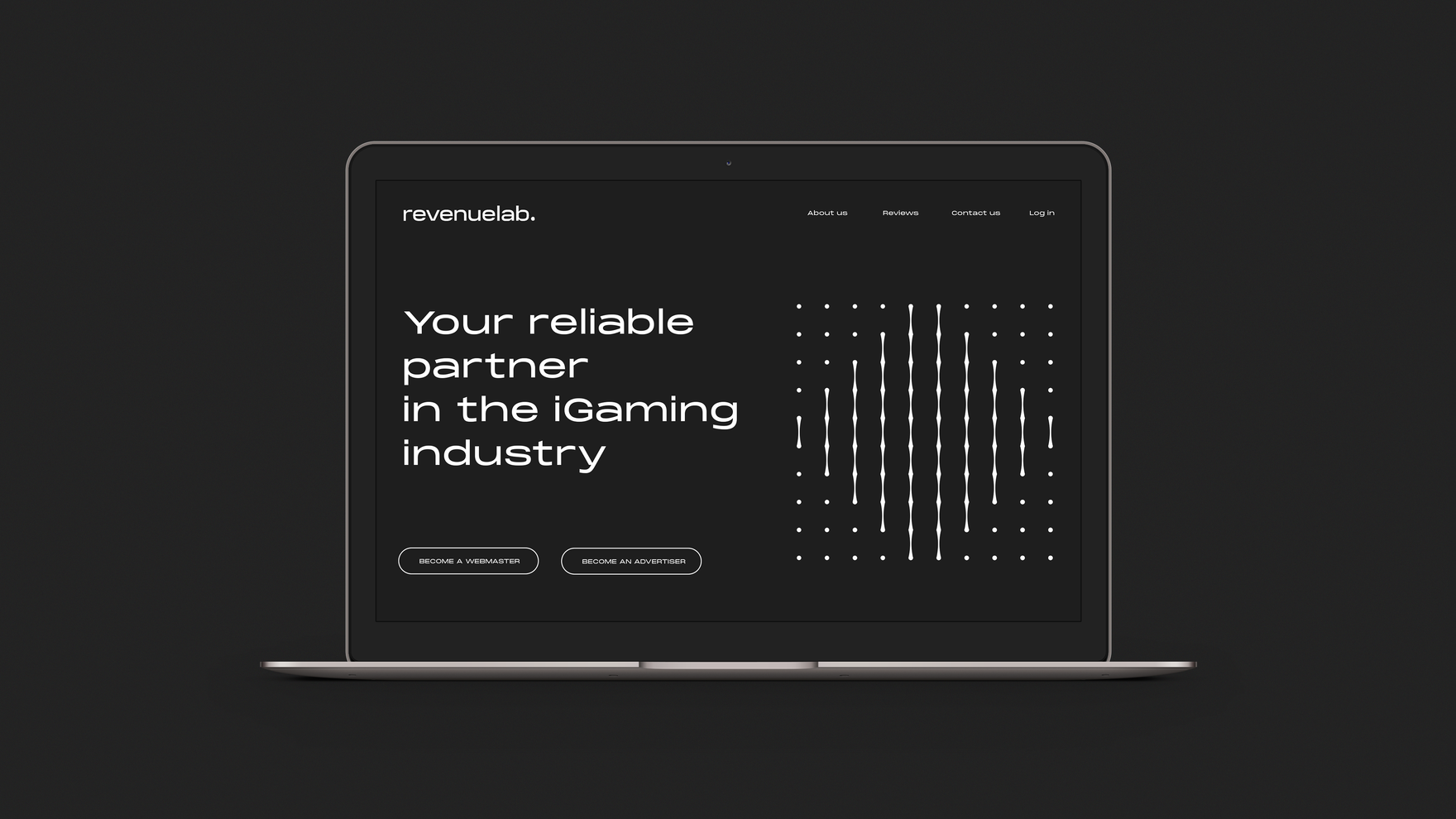
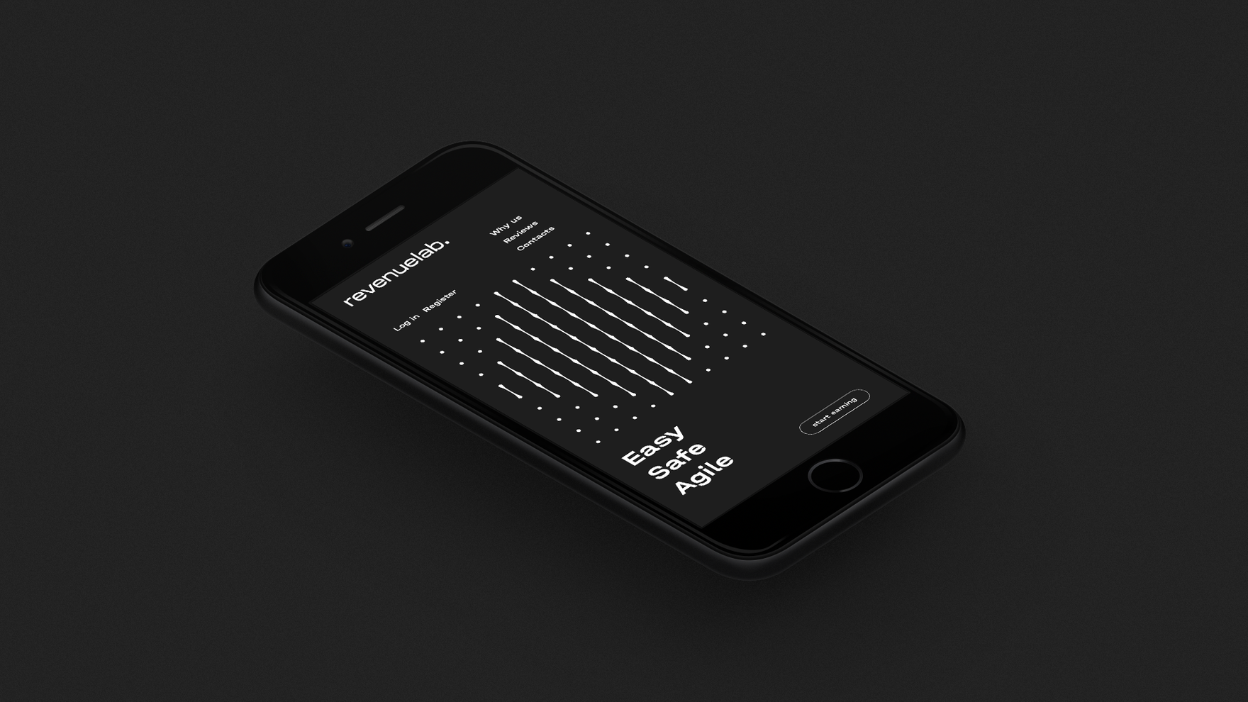
RevenueLab is experienced, serious-minded, and highly competent. It does the analyzing,optimizing, and solves complex problems involving high revenue and risk. In developing an identity for the brand, we opted for conciseness and muted colors.
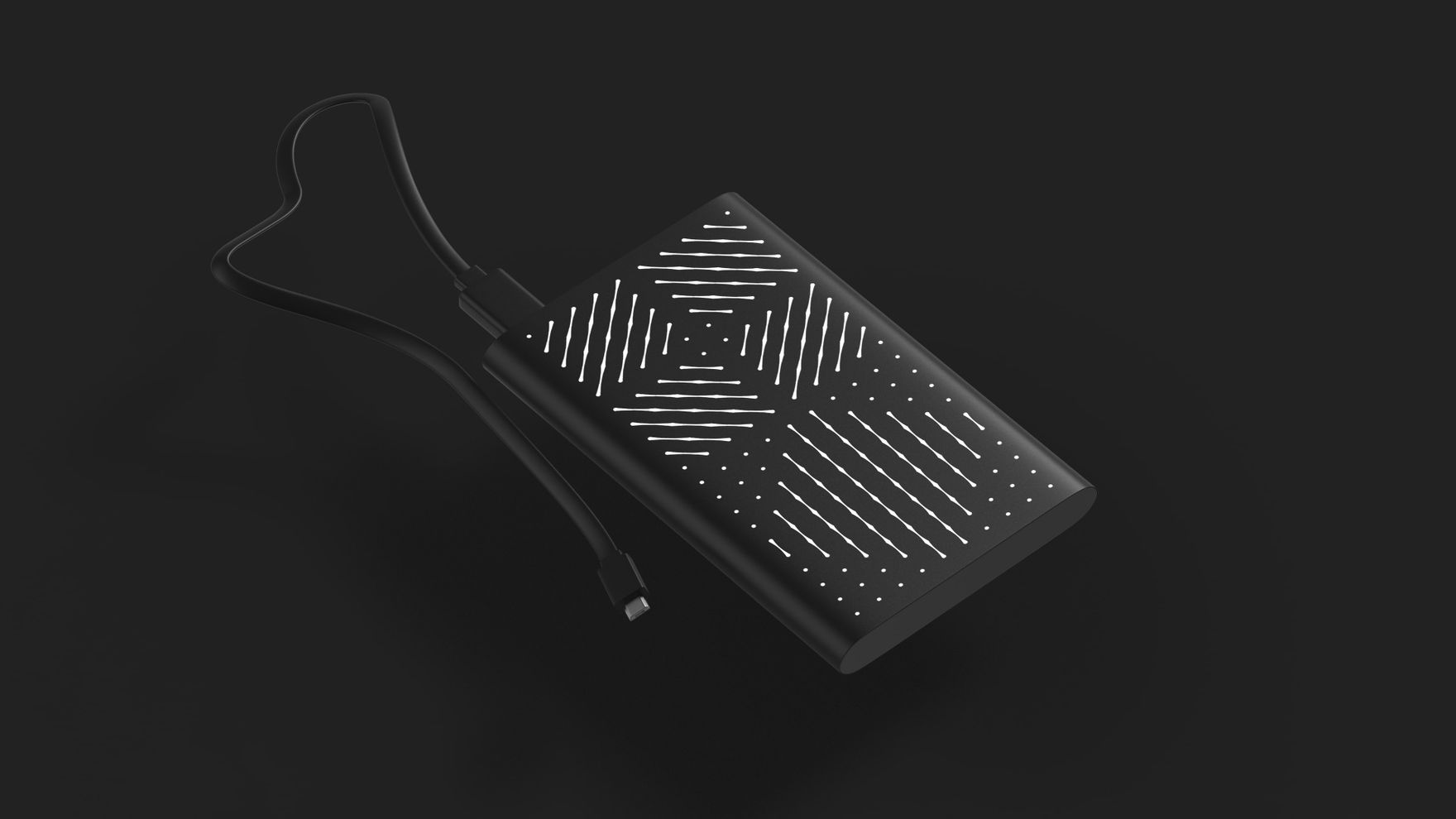
We chose a grid of dots as the visual identifier, with abstract figures as a reference to the nature of the service.
We paid attention to brand merchandise, as this is in high demand at exhibitions and client meetings.

CPA Lab is young and creative but with skills and experience inherited from RevenueLab. It helps webmasters to provide services and advice.
We took the main brand’s grid of dots as the basis for the CPA Lab identity, but made it greater using computer-generated 3D figures. Bold colors and shapes and the boldness of the solution reflect the competitive environment and nature of the market.
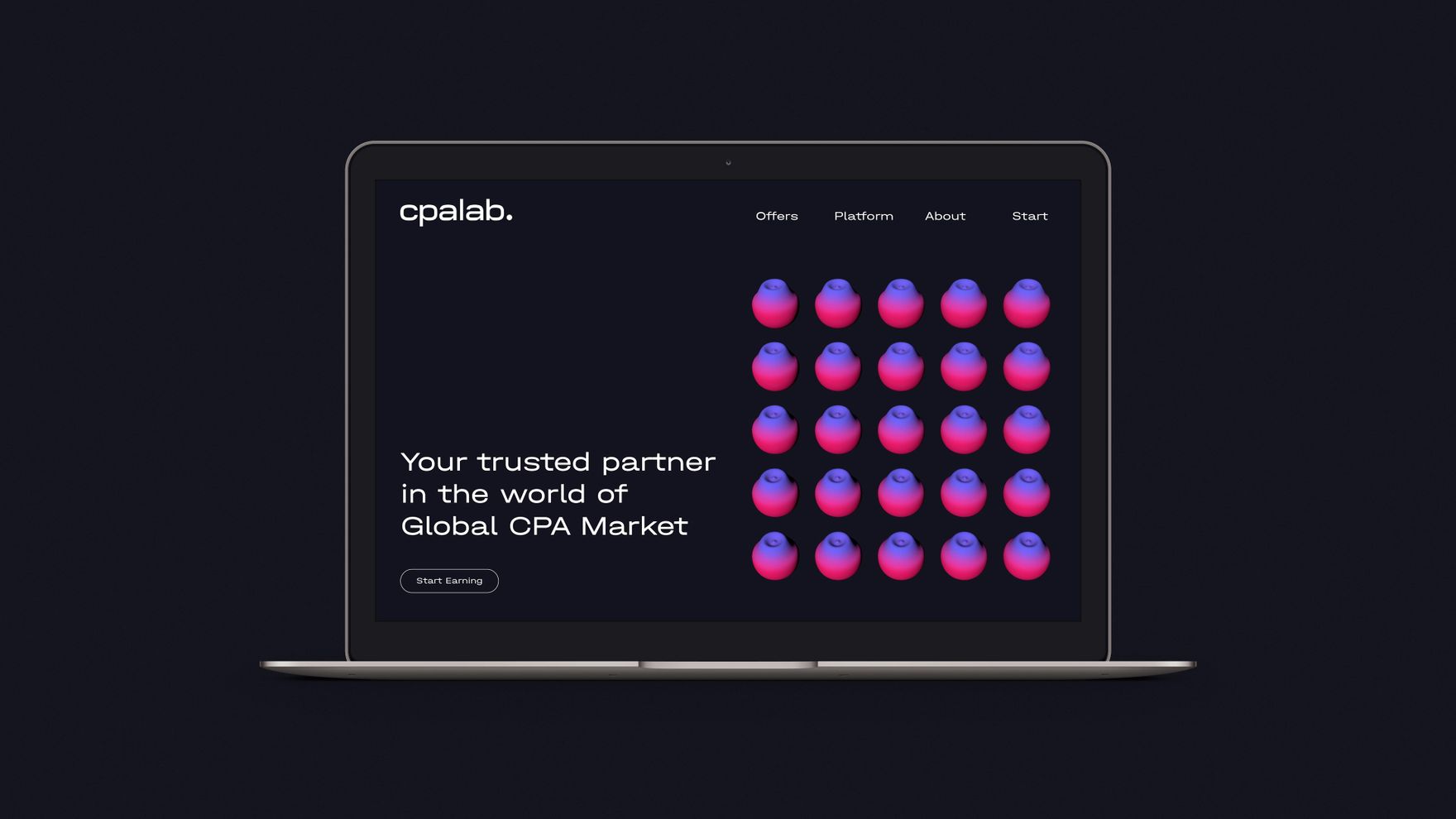

3D graphics don’t work for all branded items, so we also used 2D graphics, similarly positioned on a grid of dots. We also added color gradients to emphasize the difference between CPA Lab and its more serious big brother.
